Table of Contents
Graphic Design: UI and UX
These are my notes while taking the Complete Web & Mobile Designer course by Daniel Schifano and Andrei Neagoie on ZTM Academy.

User experience and user interface are two of the key components that make up the total flow and design of a project, but so much more go into creating a great design. Having a solid foundation in graphic design, goal conversion, and platform development can give you an edge to be a top designer. Before I get into more detail on some of the advanced topics, we are going to start with the basics and build that foundation we need to be great designers.
Resources
The main program used throughout the course, is Figma. Figma is a free design and prototyping tool that makes it easy to collaborate on projects. It is primarily web-based, but has an app that can be downloaded on mac and Windows. Below you can find the full list of resources for the course.
Fidelity in Design
Understanding Design Fidelity for Creating a Great Product Experience
Fidelity is a word that in design refers to the amount of detail and functionality in the design process. There are three levels: low, mid, and high fidelity. Low is going to be our sketches and user flows, then move into mid for wireframes, and finally, high fidelity for the prototypes of our product. Getting the low-to-mid range fidelity right, can build up a strong and effective base for your product. It allows the design to develop and change as each process is tested. By not focusing on the visual aspects of the site, the users can focus on the functional aspects in your product.
Sketching
Sketching is the first part of the design process. It is where you generate as many ideas as you can quickly and get them down on paper. Details are not important at this stage. After gathering your ideas together, you can then decide which is the best and most efficient strategy to work with. Next, you will need to sketch out your ideas into wireframes. In this step you will add details, refine the design, and cut out things that don't work. Finally, you will want to pull out the elements of the design that are the most important or repeated throughout the design. These components will really help when building the project.

Sketching Process
Every process in design has multiple steps you should take to create a successful work environment. Step one is be prepared! Gather any tools you may need before you start working. These tools could be rulers, markers, pens or pencils, or even a tablet. This way you don't forget a great idea because you didn't have a tool you needed to create it. Step two is to understand your goals and what audience you will need to reach with this design. Step three, always time yourself. Keeping yourself within a time limit helps you to focus your time and energy on the things that matter most and not get bogged down by the details while sketching. Step four is to create a frame for your design. Something like a mobile screen for an app or a desktop frame for a website, anything that will help you guide the placement of your design. Start with the simple, repeating elements and then fill in more and more details and interactions. Step five, annotate, document, and make notes on your sketches. Once you are ready, share your sketches with anyone that will listen. Everyone has valuable insight and feedback about the flow of the design that you can build off of and modify with. Step 6, the final step, is to refine your sketches. Add titles to your sketches and add more notes about elements that may be too hard to draw. Also, numbering and adding arrows to your sketches can help to label and add a visual flow that will help others give better feedback. Gestures such as pressing or swiping can be added to those sketches that reflect an action. These can be hard to draw, but using arrows for swiping or dragging and circles for tapping can be enough to get the point across.
Sketching User Flows
To start creating your first sketch, you should first understand what you need to draw. Ask yourself, what part of the project do you want to start with and decide where you want to begin. It doesn't matter what you choose, but having a clear understanding of where you want to start will help formulate your ideas. Then, you want to decide where you want to lead the users and what they need to do to get there. As you are sketching, continue asking yourself what would happen if a user clicked here or what do I want this thing to do. Think about this as the users journey through the product, from the time they enter, to the time they leave. Always be on the lookout for user misery pain-points and ways you can improve their experience.

Sketching Screen Flows
After building out your first draft, start breaking down each page and thinking about what flow will happen from it. Say you have a search bar that when a user searches, does the user need to click search or will it automatically search for results? Once the user clicks on a product, think of where the button might be to add it to the cart. In the cart, there may be another button to go to checkout. Start pulling out these similar elements and noticing where they are placed. These become your components and the groupings are where you could place your navigation or activities. Also, always think about more than one way a user could flow through the product. In this example, a categories page could be another way a user finds the item, rather than searching.
Structure
Now we need to start thinking about the navigation patterns or the structure flow of the product. In our example, we determined there was a home screen that the users would land on. Try sketching it out with more details this time and then add a home button to the navigation bar. We also created a search page that should be on the navigation bar. One thing we didn't add yet, is a way for the users to save the products that they liked. Maybe we can add a favorites page and add a heart button to the navigation. We also want the cart page to be a prominent feature so that users can find their way to checkout and purchase items. Especially on mobile, make sure its easy for the users to checkout. Maybe we can switch our navigation bar to be the checkout button and make a way to go back at the top of the page. Another thing we might need is a way for users to track their orders. After the structure is determined, we can start building out a site map, a listing of the main pages and all the branch pages that can be accessed from it.

States
At this point we have the general flow of the entire product down, but we haven't really focused on the individual pages yet. Here is when we should start thinking about the states, or actions, that might happen on each page. Take the home page, how does the search bar appear, is there a profile image, maybe a heart to favorite an item. This is where we really start to add the details to the page.

Tips for Sketching
- ◾ Don't worry about being messy.
- ◾ The more you practice, the easier it is. Use building blocks.
- ◾ Keep the sketches safe, especially paper ones. Scan or take a picture and store in a folder.
- ◾ Always be prepared. Keep something near you to jot down ideas as much as possible.
- ◾ Communicate and share your sketches.
Inspiration
Seeing a great design can create some momentary inspiration, but it doesn't always last. Creativity is like a muscle, use it or it gets weaker. "You need to constantly stimulate your creativity." - Daniel Schifano Talking to your peers and people you work with can spark ideas and help figure out design challenges. Study how other designers work and get to their solutions. Start a collection of great techniques to build your projects off of. Keep inspiration around you by surrounding yourself with great design. Your desk and computer screen can help or hurt your work flow depending on how you have it set up, make it work best for you. Read a variety of topics to keep educated in your field. Knowing about other areas can sometimes help you to approach a problem in a different light. If designing is your job, take time to design for yourself too. As much as you can, try to immerse yourself in other cultures. Whether by traveling or inside your community, finding ways to meet new people can always help expand your design inspiration. Sometimes just taking a walk can help as well.
Websites for Inspiration
- ◾ Dribbble - Create collections of design patterns.
- ◾ Pinterest - Create boards to organize your ideas.
- ◾ Behance - More details about how the product came together.
- ◾ Pttrns - Some free ui patterns, premium for more content.
- ◾ Awwwards - Gives a strict grade for great designed websites.
User Flows
A user flow is the steps a user takes to achieve a goal. A sketch of user flows is intended to communicate the steps the user takes through different pages and actions. They should include a name, step number, and type of user for each flow. The current flow you are on is what the user sees and does and then after is what they see and do next. User flows go in one direction, they don't go backwards, that is prototyping. Name each flow and label each screen descriptively based on its purpose.


Test Early, Test Often
Sitemaps
Sitemaps provide the structure for your product, they are especially useful for designers. They can help you plan out all the different navigation patterns in your product. So what is a sitemap? Sitemaps are diagrams in a specific order that show how pages are organized. Sitemaps should be created pretty early in the design process, to get a better understanding of components that are needed to build up the product.
Creating a Sitemap
A sitemap will consists of all the pages a site will have. Start with the anatomy of your product and list out all the individual pages. Once you have a list, we can start creating the sitemap. Start with the home page at the top. Each piece of the sitemap should have a label of the page it's about and a reference number for what step in the process it is. Color coding or creating a legend for your map may be useful if it particularly difficult to describe something on the map. It really is your preference on how you want to lay out the sitemap, left to right or top to bottom, anything works. Flat Sitemaps are for smaller sites because there are fewer levels to the map. Deep Sitemaps would be for a site with hundreds of pages where they go greater than 3 levels deep. Sitemaps are a valuable step because it helps strategically place content where users can find it and aids in the navigation of your product. Use the sketches and user flows you created to help you build out your sitemap.
Wireframes
Wireframes provide a blueprint to our product by detailing information that is displayed on each page, providing an outline and structure to the product, and describing the direction and message of your product. It is a way to use everything you've created up to this point to really start putting the site together. Wireframes will help you better understand how users will navigate through your product and make sure their are efficient pathways. Build off of them and learn from the feedback you get to better the product. Failing can be good if you learn from the mistakes and fix the problems. If you are working on a team, wireframes can help everyone get on the same page with the layout. Even if you aren't on a team, get users to test your product. This always uncovers pain points and places where you can improve the user experience of your product. Wireframes are also a great way to get feedback from clients. The earlier you can find and fix issues, the easier it will be once we get to the final product. Remember to keep it simple, more detailed than the sketch, but not the final design. Start with pencil and paper and then move your sketches to a program like Figma to allow for easier sharing. If you are sharing with a client, add a little more polish to the product to make it look presentable and make sure to explain that this is to showcase the interactions, not the visual design of the product.
Prototyping
Feedback
Getting feedback throughout the design process is a great way to help see issues, but it may not always feel easy to get feedback or nice to get critiqued. However, finding the issues earlier in the process can make the whole project be more efficient and better in the long run. There are two types of feedback that can impact your design, constructive and destructive. Constructive feedback can still be positive or negative, but will still aid in the design process. Destructive feedback impedes the design moving forward. It is mostly caused by asking users the wrong questions or misleading them. Clients can even get off on a topic that is not relevant to the current stage of the design process. You need to be the one that gets others to give constructive feedback. Be as clear as possible when explaining the context of what you want feedback on. You can send a message ahead of time to inform them of what you need. Another thing you can do is set goals that you want to accomplish at each stage. Break down which aspects need to be focused on and what questions need to be answered. Make sure to explain what stage of the design process you are in so that they know what to expect. In a meeting format, it can be overwhelming to have too many people giving feedback at one time. Only invite the people you need to, think about who would have the answers to your questions. Try to get the group involved by generating, voting, and then discussing all of the ideas. Make sure to stay focused and keep on track. If good feedback is off topic, remember to bookmark it for a later time.
Grids
A grid is a structure that divides a page into a series of rows and columns. But the history behind them is so much more than that. The golden ratio is a mathematical equation that can be traced back in design as far as the Egyptian pyramids. The mathematical calculation states, if the ratio of 2 sides is the same as the ratio of the sum of the 2 largest numbers. It is approximately 1.618. In the beginning, grids were always linked to print or typography. However, in the Renaissance period artists started using grids with the golden ratio to add balance to artworks, sculptures, and architecture. With newspapers came even more grids to align columns, so they could fit more content while still allowing natural reading behavior. Our modern grid started emerging after WWI in Europe, it was further developed in Switzerland during the 1950s to become the International Typographic Style or Swiss Style. Some key components of Swiss Style are grids, sans-serif typeface, and the use of white space.

Grid Basics
Always start with the basics. In this case, base units. The base units are going to define what every other unit is based off of. They make the whole design easier to scale and handoff. The base unit that is the most recommended is 8px because most screen sizes are divisible by 8 and its divisible itself. Personally, I like to start with 16px base because 8 is so small to read. All other UI elements should be in increments of the base unit. Grids are made up of 3 pieces, columns, gutters, and margins. Columns are the vertical sections that go from left to right. Typically a 12 column grid is used, because it can be divided in so many ways it makes it more versatile. Keep in mind, most desktops today are extremely wide. Use max-width to contain your grid so users don't have to turn left to right to view all of your content. Gutters are the white space between the columns. Margins are the outside edges of the columns that separate the grid from the edge of the screen. The gutter and margin size are going to be a multiple of the base unit. Here are a few different types of grids.
- ◾ Manuscript Grid - Used for defining margins and large blocks of text.
- ◾ Column Grid - The grid most used in web design, columns spaced evenly across a page.
- ◾ Modular Grid - This grid has both vertical columns and horizontal rows covering a page.
- ◾ Baseline Grid - Horizontal rows going top to bottom across a page, similar to a notebook you write in.
Layouts
Using multiple types of grids together can help balance and visually enhance your design, but once you get your grids on a page, there are still more choices to make. The responsive part of the grid comes with choosing between fixed, fluid, and adaptive grids. Fixed layouts will stay the same no matter what the screen size. Fluid layouts will stretch and shrink with your content. Adaptive layouts will change to use different grids depending on the screen size it is at. By using breakpoints, you are able to change the design of the page for different screen sizes. There are far too many screen sizes out there now to worry about specific breakpoint numbers. Using just small (600px), medium (768px), large (1024px), and extra-large (1280px) sizes will be a good starting off point to get an idea of what the layouts should be.
Typography
Typography means the style and appearance of our text. There are a few types to choose from and combining these together correctly can be a great way to enhance your design. Serif is a traditional typeface with serifs, or tails, at the edges of the letters. Serifs have many different types just within that style. Here are just 4 of them.

Sans Serif is a typeface that may come as no surprise to you means without serifs, those little tails on the edges. It is one of the popular typefaces used today and was popularized by the Swiss Style. They has 4 types within it.

Display typefaces are the broadest and include the most variation between them. They are typically used only in headlines or shorter copy to draw attention to it.
Script typefaces can resemble handwriting in the cursive style. They are very fluid and have 2 basic classifications, formal and casual.
Mono is the final typeface styles. It is a fixed-pitch, or fixed-width, font where each letter is takes up the same amount of space. Typically used for code blocks or places where the content needs to look more technical.
Choosing a Typeface
When working for a client, you may have a limited choice of fonts you can use. Thinking about adjusting the line height, increasing the spacing of the letters, or using different font weights can really change the look and feel of a single font. Another scenario, is the possibility of too many choices. When presented with lots of options, try to narrow down your options by thinking about the brand it is representing. What are the goals of the product? Are they more traditional or more modern? What platform is it centered on? Another tip is to go to Google Fonts and type in a heading and just visually see what looks the best. Choose a few that you think look good, download them, and try them out with some mockups.

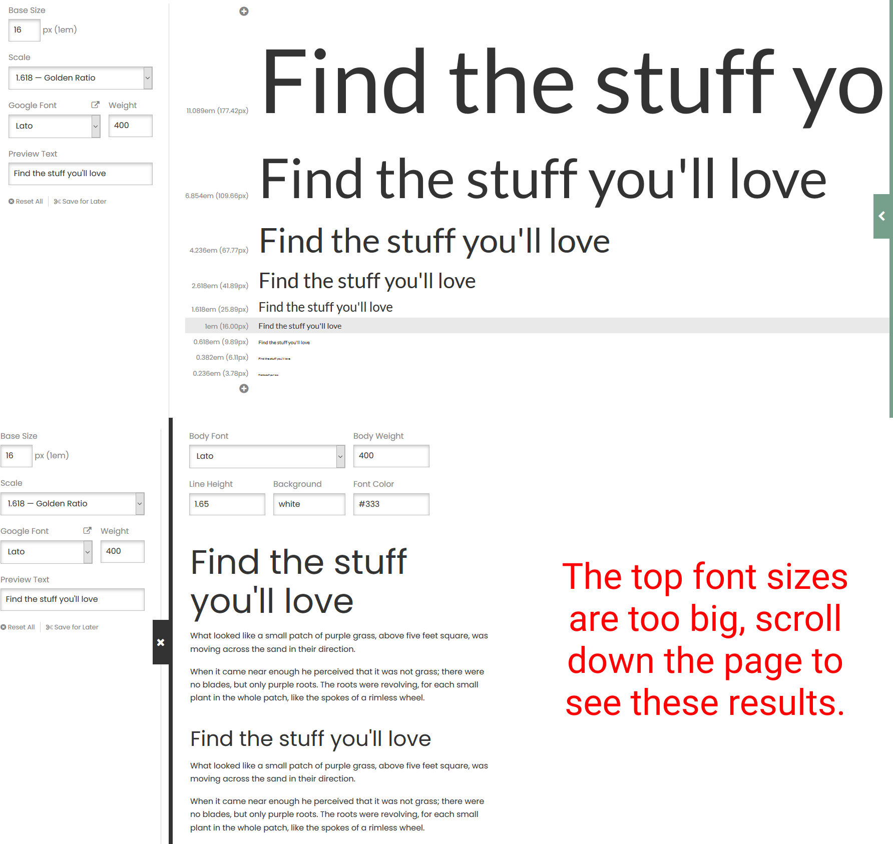
By taking a base font size of say 16px, you can multiply that by the golden ratio of 1.618 and get multiples for your heading sizes. You would end up with 10px or 0.618em, 16px or 1em, 26px or 1.6118em, 42px or 2.618em, and 68px or 4.236em.These are along that golden ratio curve and are appealing to the eye. Perhaps an even easier option is to head to fontPair.co and find 2 fonts which go well together. Then, head to Type-Scale.com and set the 2 fonts you found. On the left on type-scale, you can choose the heading font and use the drop-down to select the golden ratio. If you picked a second font, you can pull out arrow from the right to get the body font and see them together. Now your whole type system is ready to go!
Color
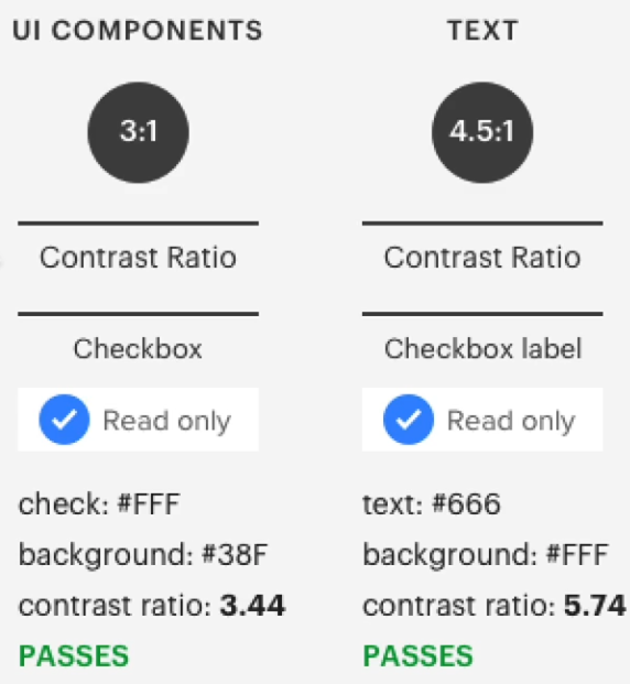
Before choosing colors, ask yourself what message does the brand want to communicate or what problem is it trying to solve. Colors can really influence the personality of the brand. Another thing to look at is who the target users are. Knowing the demographic of the users and if there are cultural influences can really help in choosing the right colors. Think about what the colors mean to you as well. The psychology of color is a powerful tool that shapes how we perceive the world. Colors should be able to be scaled or added to, by having a mini monochromatic pallette within each color. You can add depth to your blacks and grays by adding in hints of the brand colors. Sometimes black comes off as too harsh if left untouched. The most important thing when choosing colors, it to test for accessibility. Make sure there is enough contrast between backgrounds and foregrounds to ensure it is readable for everyone. Colorable allows you to test 2 colors for accessibility on the web as well as plugins within Figma like Contrast.
Color Schemes
Color schemes help us to create harmony and evoke feeling in our design. Monochromatic schemes pull from 1 primary color and uses different shades of that color. It is the simplest and least distracting color scheme. Analogous takes 3 adjacent colors from the color wheel to comprise it. This creates a very blended, simple color pallette. Complementary schemes use colors that are directly across from each other on the color wheel. This gives high contrast and can make a design feel brighter and more prominent. Split-Complementary which uses 1 color and the 2 colors adjacent to the color opposite the first. It's similar to complimentary in that its bright, but gives more versatility. Triadic creates a triangle on the color wheel where each color is exactly 120° from each other. It is a little less contrast than complementary, making is more versatile. The pallets are bold and vibrant. Tetradic is the last color scheme. It uses four colors that are evenly spaced on the color wheel, but can be difficult to get right. More colors makes it harder to balance, sticking with 3 or less is usually the best option. Coolors.co is a great site to help you find color pallettes as a starting point.
Forms
A form is one of the most common UI elements. Search bars, login or signin areas, text inputs, and payment info when purchasing online, they are everywhere! Getting the forms right in a product is crucial to its success. Start by planning out the forms that will be needed within the product, just like a wireframe. Ask what types of questions you need the user to answer and narrow down what is really needed for each specific form. They should flow like a natural conversation with the user. The placement of the inputs inside a form should flow as well. Keep lines aligned in a column and broken up into categories to allow space between long groups of inputs. Buttons within a form should be clearly labeled and styled appropriately. Keep the height of inputs and buttons the same to maintain the visual consistency. Labels should contrast the text in the input and be kept concise. Placeholders are generally a bad idea. Screen readers don't read them and they disappear as soon as the user starts typing. If hints are helpful for a particular input, lay it out opposite the label or elsewhere appropriate to the design. Visual feedback and icons can help improve accessibility when used correctly. Always put feedback to an input inline with the form.
Form Demo
Input Demo
Button Demo
Demos
The Visual Assets section is mostly visual explanation and working in Figma. I have embedded the resources below, but I am not going to have any notes until the accessibility section.
Imagery
Illustrations
Icons
Accessibility
We want our products that we design and create to be usable by people with a wide range of abilities. If just one person can't use your design, then you have failed them in a sense. This is the process of accessibility, making things accessible to all people, disabled or not. In fact, thinking about creating an experience that works for all users, actually makes the experience better for everyone. "Accessibility is not a checklist. It should be ingrained in the way we design." - Daniel Schifano
Assistive Technologies
- ◾ Screen Readers - A program that reads the content of a web page created for visually impaired users.
- ◾ Braille Terminals - A keyboard created for the blind or visually impaired users to navigate a computer and the internet.
- ◾ Screen Magnifier - Enlargers a portion of the screen that the user hovers over.
- ◾ Alternate Input Devices & Software - These include voice and push buttons the control the actions on the computer.
Visual Patterns
Lots of things play into creating accessible content on the web, but let's look at a few of them. Color contrast is a big one that is really easy to get wrong. Color Safe is a great place to start for picking accessible colors if you have not chosen a color pallette. However, if you already have brand colors you need to work with, Colorable is a great site to ensure they are compliant to the contrast ratios. Google has a tool as well called the Color Contrast Analyzer that you can run the website through to test.
Focus state on form elements and buttons is a must for screen readers. Make sure to have something there that is also contrast compliant, even if you remove the default styling. Off screen content can sometimes be picked up by screen readers as well. Make sure to keep that in mind and make the necessary changes in the code. Modals, hover states, and click targets are all areas of concern for accessibility. The size of clickable content needs to be large enough to be clicked easily, but doesn't always have to increase the size of the design. The clickable area can be larger than the item itself, which can help a user with motor impairments. As with testing, start thinking about how to make your products accessible earlier in the process. Collaborate with the developers or make sure to include code to make the design accessible.
Design Patterns
A design pattern is a general solution that can be repeated to commonly occurring problems. The first step is to analyze the problem and then to find ways to eliminate or aid in the pain points. Detect usability issues with real data from testing and feedback. Next, look at how other brands and products have solved this problem. Having multiple examples of how a solution is implemented can give you more insight if this is something that will work for your product. Finally, choose the one solution that will work best for your product. This is why lots of designs look the same across varying sites, because these patterns are standards that are proven to help users. You don't always need to create innovative ways of doing things, but always seeing the same thing can get boring too. It's a delicate balance of good design with good user experience. Design patterns can be put into 6 categories.
- ◾ Data + Input - Products that give feedback and response to data they receive, like a drag and drop ui.
- ◾ Content Structure - The structure of the content on a page that streamlines the flow and ensures accessibility of product.
- ◾ Navigation - Ensure the ease of navigation through the product, includes sidebars, hamburger menus, and nav bars.
- ◾ Incentivization - Provides the user with positive feedback to get the user to keep using your product.
- ◾ Hierarchy - Gives a flow to the product to visually establish important or primary elements.
- ◾ Social Media - Encourages users to share the product with members of their social networks.
Our minds are wired to always look for patterns in the things we do repeatedly. We are looking for efficiency and easier access to things constantly. Using these standards creates less cognitive strain, or brain power, to use a product. Design patterns provide the solution to a lot of problems that are out there.
Mobile Design
Having a great user experience in an app is key to having a successful product. Make sure users don't have to think too much to use the product. If areas of the app are too hard to use or understand, customers may give up. One way to accomplish this is to unclutter the unnecessary pieces and make sure only the important information remains. Keep the interface clean and minimal and break longer tasks into chunks. Also, with forms pre-formatting input fields for better readability, auto-completion, and correctly placed hints will go a long way in helping a user. Make sure the design has consistency throughout. Using the same colors, typefaces, and interactions make the app more cohesive and easier to use. Providing predictability in the design patterns allows users to feel they already know how to use the app. Probably the most important thing to remember, is to make the app easy to navigate. Users should be able to go where they want within the app easily and get back to the previous screen. Don't mix different navigation patterns, find one that works well with the app and keep it consistent.
Motion
Microinteractions
Microinteractions are the small interactive reactions that happen when triggered by a user. Even small animations can be really powerful and go a long way to help the user experience. Start thinking about animations and interactions early in the design process to refine them, they let the user know what's happening and really encourage engagement. Even though they may seem simple, microinteractions have a structure. There are 4 parts to them:
- ◾ Trigger - user initiated interaction such as a page refresh, adding to cart, or navigation animations.
- ◾ Rules - defines what happens during an interaction, the steps that need to happen.
- ◾ Feedback - tells the user something is happening, like an input being correctly filled out or not.
- ◾ Loops & Modes - the loop will determine the length of the interaction and whether it repeats, modes will change the way interactions normally happen.
Design Systems
A design system is a single place where all the elements needed to design a product live. It creates a single source of truth for each individual piece in the design where anyone on a team can see and use easily any part of the design. A common methodology for design systems is atomic design. It is based on the book of the same name by Brad Frost and breaks a design system up into atoms, molecules, organisms, templates, and pages that work together to create an entire system for a product. Each piece builds on the piece before it and adds more to the design. In the course, Daniel uses a foundation, components, and recipes which is a similar methodology to build upon pieces to build out an entire product. The foundation has colors, typography, icons, and other individual items that may be used in the application. Components is where pieces from the foundation are put together to make reusable items such as buttons, inputs, and cards. The recipes section is where all the components come together to make even bigger groupings of what will make up sections of an app or page. The biggest thing to remember is that design systems are ever evolving.
Product Alignment Canvas
Something that makes working through a project easier is a product alignment canvas. The goal is to explore, understand, and move forward. You can use figma remotely or in a meeting with everyone that is working on the project. Ideally, you would have someone to take notes so you can focus your attention on what is being said. Create a graph that shows the risk level of certain ideas and get feedback on where each piece would lie. Such as, if we don't know who our users are, this is a high risk and high priority item to take care of. Try to get a good understanding of what the project goals are and who the target users are. The next piece is to make a user journey map. The user has been identified and the primary goal is set. Define all the steps the user would have to complete to primary goal on the map. Finally, all of these pieces can be brought together to create a user story map to define the details of how tasks happen within the app.
Product Handoff
Historically, a designer would work on a project, by themselves, and just hand off to a developer once they were finished. This left the developer to create a pixel perfect design with no communication on how a design might work in development. The designer usually communicates with the client and the developer may be left in the dark. In newer systems, companies are finding that working in teams and concurrently along with developers, products can be developed more cohesively. The idea of mutual collaboration and respect creates a better work environment and better products for the user in the end.